01
Brwnsclub

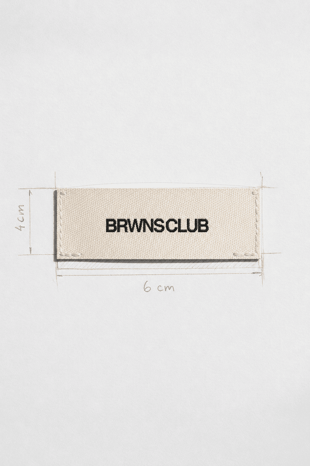
For the wordmark I looked at the big fashion houses. Almost all of them use a plain typeface logo, and that's exactly why they still look right decades on. So I kept Brwnsclub's clean and minimal, set in Helvetica Neue with tight tracking.


For the monogram I looked at MLB team logos like the Yankees and Dodgers. They've barely changed in decades and you recognise them without reading them. I designed the BC monogram the same way, as a mark I can put straight onto the clothes.